Build your own maps with this open source D3 Philippine cartogram
For mapping social data, more data visualizers are ditching traditional geographical maps for cartograms – maps that substitute land area for another variable, like population.
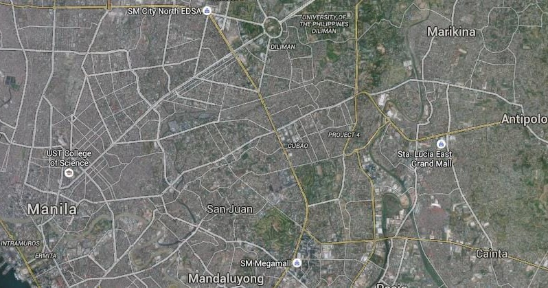
The problem with geographical maps is that they sometimes don't accurately represent data about people. For example, Metro Manila only occupies a tiny spot on the Philippine map, but accounts for a huge chunk of the total Philippine population.
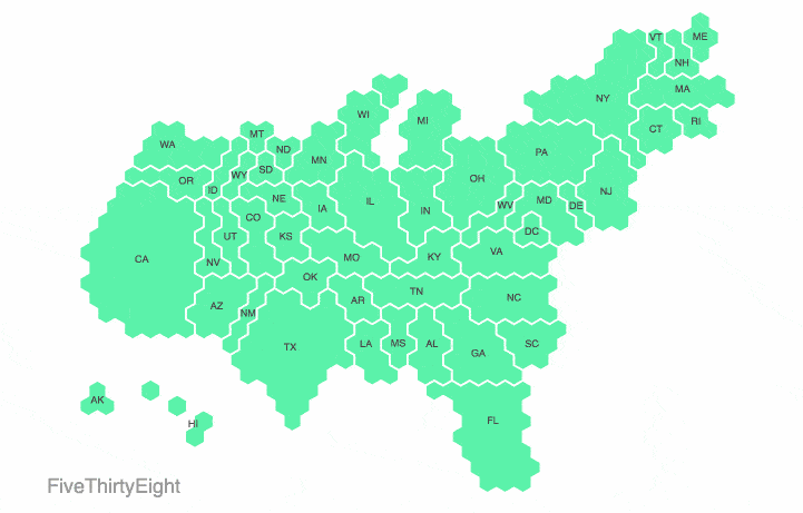
Because cartograms try to solve this problem, they've become more popular in international news media. NPR, the Washington Post, and FiveThirtyEight have all used cartograms in their coverage of the 2016 US elections:
Noah Veltman, data visualizer at WNYC, made this morphing animation of election cartograms produced by four different news organizations. Source: Wired.com.
But cartograms can be a pain to build. Trust us, we’ve tried. There are a few existing tools you can use, but they don’t always produce the most attractive results. You can also try manually building one, like we did last May for the Philippine elections. But this can be a major time-suck and isn’t scalable.
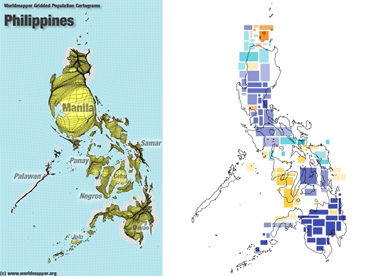
Two examples of Philippine cartograms. On the left is a Philippine population cartogram made with Worldmapper. On the right is our manually-constructed Philippine election cartogram laid over the Philippine geographic map.
To make life a little easier for anyone interested in building a Philippine cartogram, we’ve developed a bit of open source code with d3 and topojson. You can use this code to customize your own Philippine map with different variables and colors. Check it out:
Philippine Population 2015
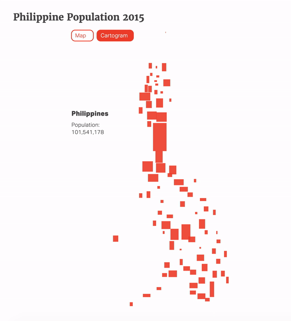
Philippine Population 2015
How to use it
Download the files at our Github: https://github.com/thinkingmachines/cartogramPH.
Some CSS rules you should include:
.chartbtn {
    margin-top: 30px;
    margin-bottom: 25px;
}

.tiny {
    font-size: .8em;
}

.munid {
    font-size: 1.2em;
    font-weight: 'bold';
}

.hidden {
    display: none;
}
Make sure you include all the javascript libraries required:
<script src="//ajax.googleapis.com/ajax/libs/jquery/1.9.1/jquery.min.js"></script>
<script src="//d3js.org/topojson.v1.min.js"></script>
<script src="//cdnjs.cloudflare.com/ajax/libs/d3/3.5.6/d3.min.js" charset="utf-8"></script>
<script src="/cartogramph.js"></script>
Don't forget to put the data files in your data folder: philippines-topo2.json and philpoverty2015.csv!
Insert a div in your body:
<div id="vis"></div>
All you need is to make sure that you are pointing to the right data files and call the simpleCartogram function with the ID of the div you want the chart to appear in and the color of the map:
//defaults
var GEODATA = "data/provinces.json"; //link to the map json source file
var POPULATION = "data/philpopulation2015.csv"; //link to population data
var POPULATION_COL = "pop2015"; //population column name
var POPULATION_LABEL = "Population"; //label

<script type="text/javascript">
    simpleCartogram("#vis", "#ef4631");
</script>
How we made it
For each province, we generated a rectangle sized relative to that province’s share of the Philippine population (based on the 2015 Philippine Census of Housing and Population). We based the aspect ratio of each rectangle on the width and height of that province’s geographic bounding box, which we extracted from a topjson file of the Philippines. Each rectangle was placed at its province’s central point on the map.
Because there is a lot of overlap between the shapes, a collision detection algorithm in D3 was used to make the different areas more distinct. Provinces above Metro Manila were shifted a bit upwards vertically, while the areas south of Metro Manila were shifted downwards.
How to use a different variable aside from population
You can reconfigure our code to easily generate a cartogram that uses a variable other than population.
Call the customCartogram function with the ID of the div in which you want the chart to appear, the path to your new data source, the name of the value column in the csv file, the label of the value, and the color of the map.
When using a new csv file, make sure that the province names match each other and are in all caps.
<script type="text/javascript">
    var customDataSource = "/static/data/random.csv"; //link to population data
    var customColumn = "random"; //custom variable
    var customLabel = "Random"; //label of variable

    customCartogram("#vis2", customDataSource, customColumn, customLabel, "#00aac5");
</script>
Random Numbers
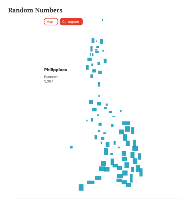
Random Numbers
How to turn the cartogram into a choropleth
If you want to turn your cartogram into a choropleth or heatmap, that’s also doable.
Call the chloroplethCartogram function with the ID of the div in which you want the chart to appear, the path to your new data source, the name of the value column in the csv file, the label of the value, and the color of the map:
<script type="text/javascript">
    var chloroplethDataSource = "data/philpoverty2015.csv"; //link to population data
    var chloroplethColumn = "poverty2015"; //name of column in csv file
    var chloroplethLabel = "Poverty Rate"; //label of variable

    chloroplethCartogram("#vis3", chloroplethDataSource, chloroplethColumn, chloroplethLabel, "#c30202");
</script>
Philippine Poverty Rate 2015
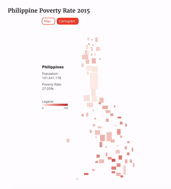
Philippine Poverty Rate 2015
If you make something cool with our cartogram code, we’d love to see it! E-mail it to [email protected] or tweet us at @thinkdatasci. We’ll share our favorites on this blog post.
Go forth and map!