Off the map: An alternative way of visualizing the Philippine election results
A map is not the territory. Maps are a very common visualization tool but don’t kid yourselves, there’s more than one way to draw a map. Since maps are the basis of land claims, borders, and resource allocation, they are rightfully the subject of intense debate, conflict, even war. "Maps tell a story. And maps can also lie," writes Joshua Tauberer, an American civic hacker, in his article comparing different kinds of maps.
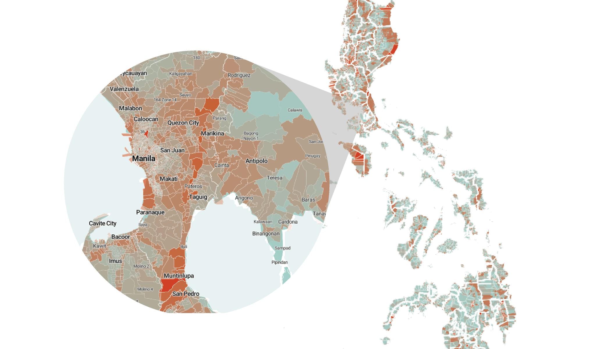
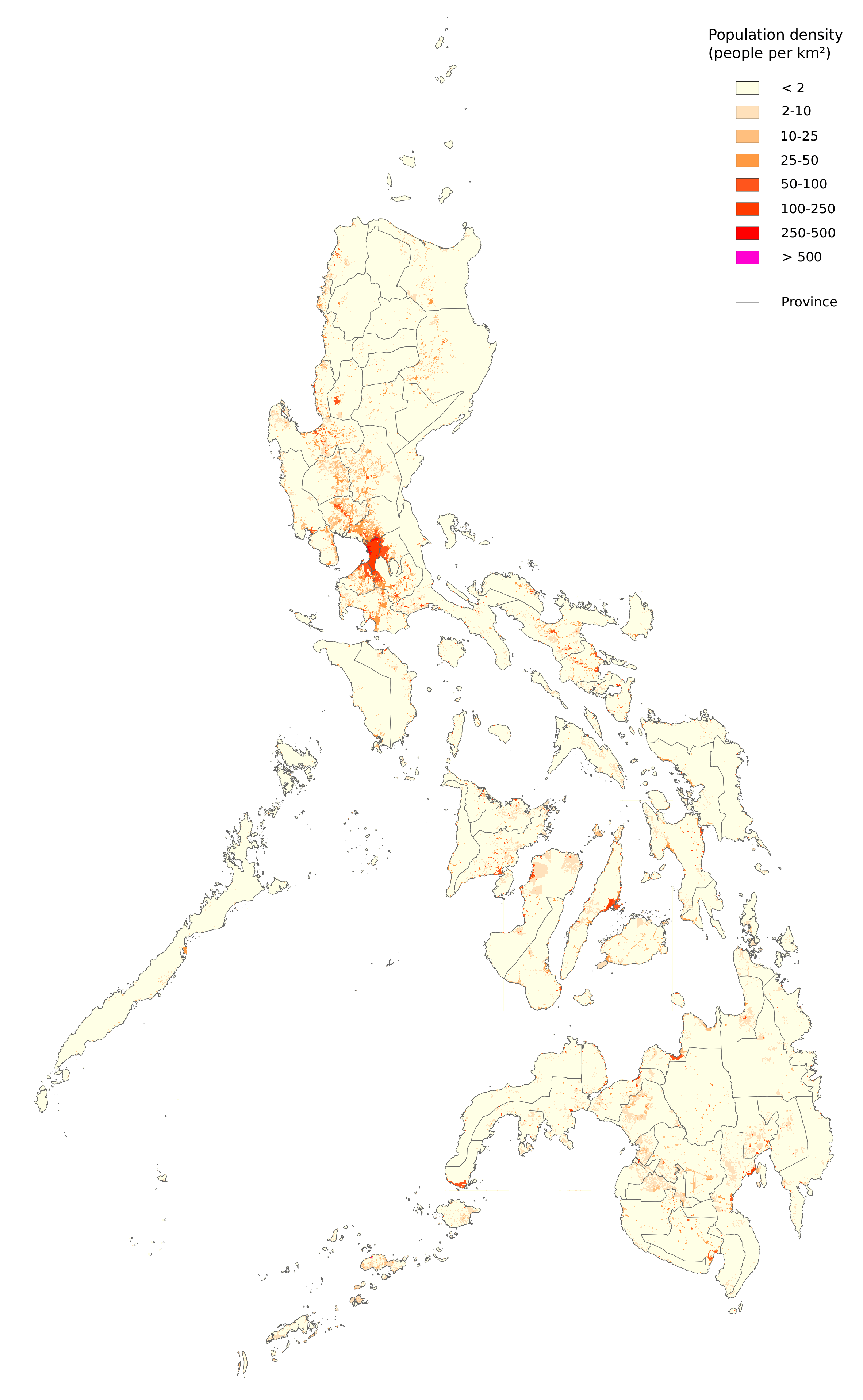
During the recent elections, all Philippine media outlets used standard geographic maps to show the results of the 2016 presidential and vice presidential races. Here is an example from Rappler:
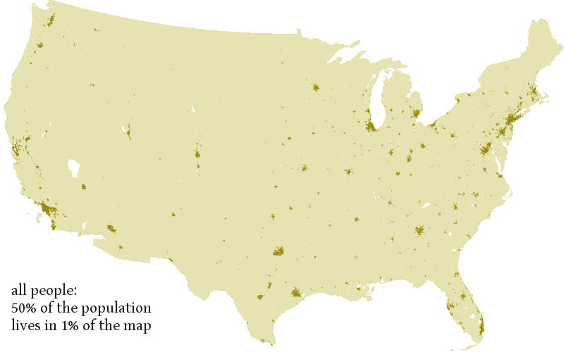
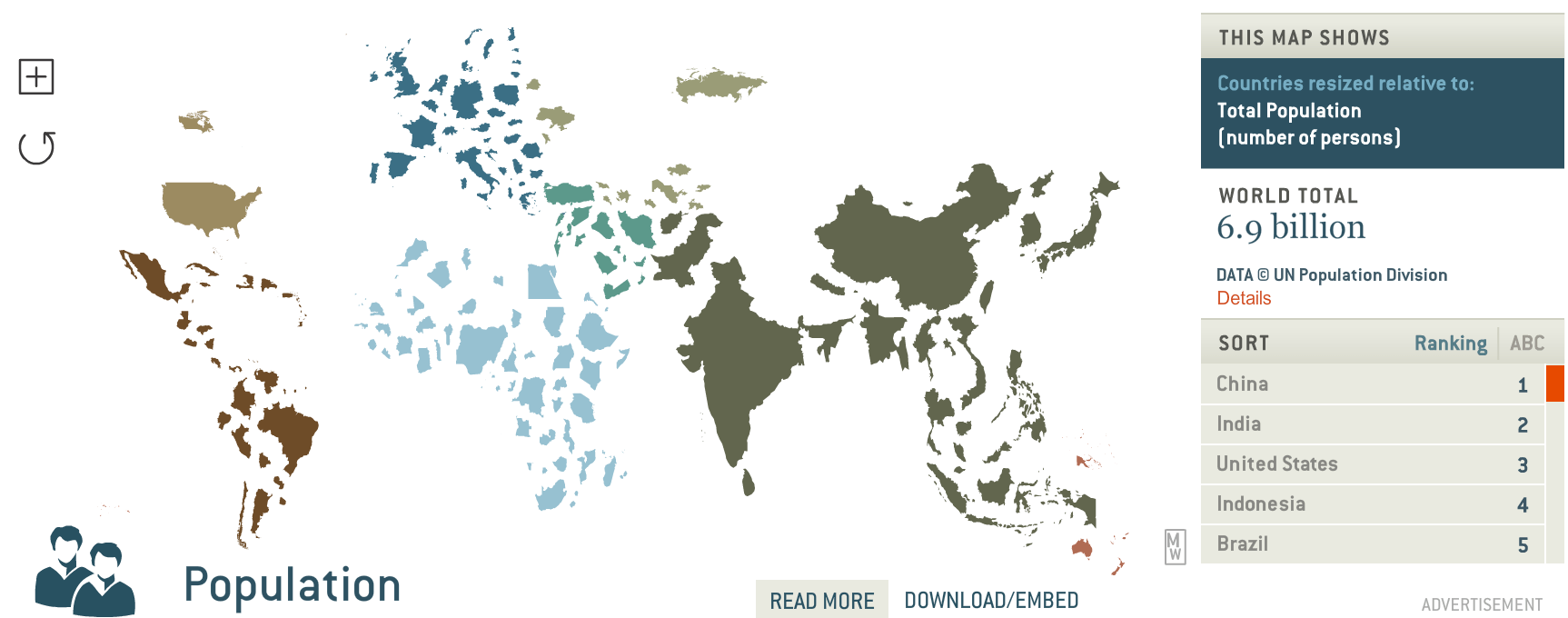
In this geographic map, the color represents the candidate who received the most number of votes in the province or city. The problem is that the geographic size of the area is never proportional to the population. Tauberer demonstrates this situation in the US map in his article. In the American map, 50% of the population live on 1% of the land area. The low density areas are big in the map and can skew readers’ interpretation of how much popular support candidates have.
In the Philippines, 10% of the population lives in Metro Manila, a tiny segment of the map. Because of its importance, the area often has to be shown in a separate section, as we saw on Rappler’s map.
How can we fix this representation? Let’s look at cartograms. A cartogram is a type of map where land area is distorted in order to display an alternative variable. In this case, what we care about is the number of registered voters, as obtained from COMELEC.
Cartograms can be non-contiguous, meaning that the different areas don't necessarily have to be adjacent to each other. This allows the cartogram to preserve as much of the original shape and topology of the geographical area as possible. Mapping Worlds creates animated non-contiguous maps like this:
David Garcia, an urban planner, has taken the contiguous approach in the map below, where geographical areas maintain their shape and connectivity but their size warps based on their number of registered voters.

In Garcia's cartogram, Metro Manila eats up central Luzon and completely distorts the map. Cebu is the most vote-rich area and it unsurprisingly gets a lot bigger in this map. Mindanao, on the other hand, shrinks.
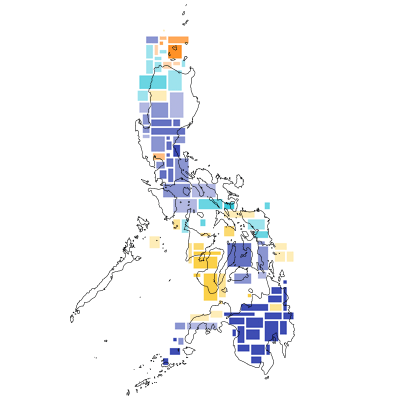
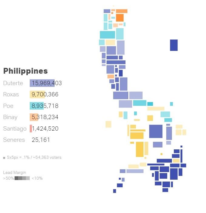
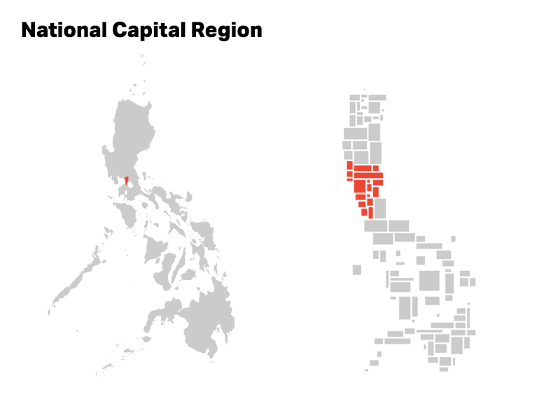
In our version, we created a Demers cartogram with rectangles representing provinces and the cities in the National Capital Region (NCR). We tried to keep the geography as close to real life as possible to avoid being misleading like this county result cartogram in the US elections. We were able to include the National Capital Region (NCR) in the larger map, while adjusting its size to reflect the number of registered voters. To give you an idea of our scale, 5x5 square pixels in our interactive cartogram at the top of the article represents 0.1% of all 54,363 registered voters.
In the Presidential race cartogram, Duterte won seven out of the top ten vote rich provinces in the country, giving him a commanding lead over his opponents. He won more than twice the number of provinces than runner-up Manuel “Mar” Roxas III. He also had the widest margins in Mindanao.
In the Presidential race cartogram, Duterte won seven out of the top ten vote rich provinces in the country, giving him a commanding lead over his opponents. He won more than twice the number of provinces than runner-up Manuel “Mar” Roxas III. He also had the widest margins in Mindanao.
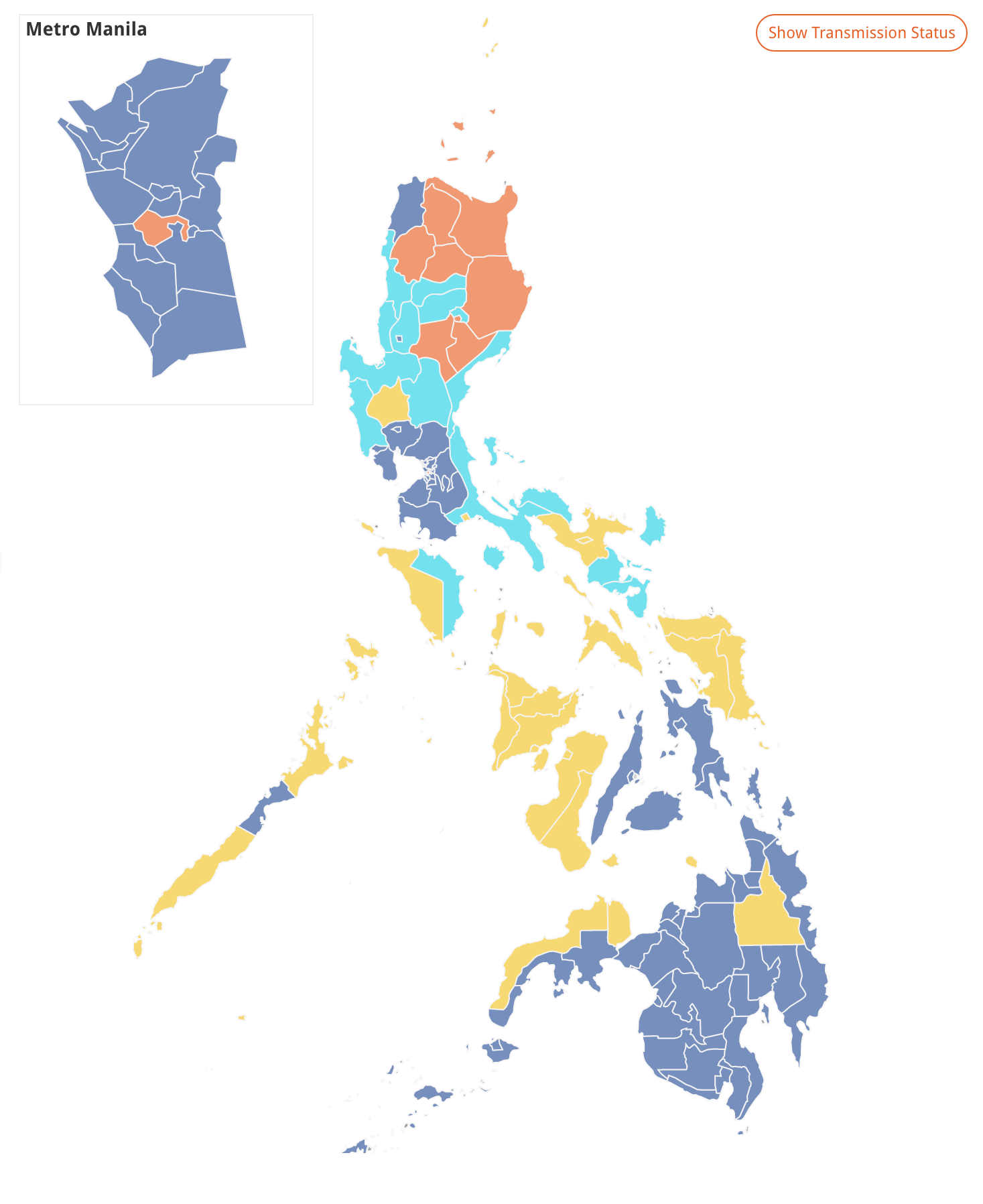
The VP race cartogram shows that Bongbong Marcos actually won more provinces and cities but since he only eked out marginal victories against Leni Robredo in the more vote-rich areas, he wasn't able to secure a lead in the popular vote. Marcos took the bulk of the populous provinces in the Solid North and many of the smallest provinces but Robredo prevailed by racking up formidable margins in the mid-sized provinces.
We go one step further in visualizing how the presidential and VP races played out by adding an extra variable--the size of the victor’s lead over his or her runner-up. The darker the color of the province’s rectangle, the wider the lead, which gives us an easy visual shorthand for not only which provinces the candidates won, but by how much.
Future iterations of this cartogram will go further down into the city/municipal level - which we have 1,634 of as of this year.
Data Sources for Election Results (96.14% Transmission Rate as of writing):
Enjoyed this data story? Want to supercharge your content marketing strategy with data? Send us an email at [email protected]
If you have any questions about this dataset, tweet us at @thinkdatasci to get some answers!